Me, Myself and I-
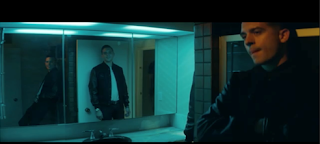
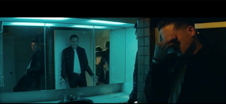
The way in which that this video links
heavily to our music is the fact that for the second half of the sequence we
were actually inspired by the video itself rather than the music side. We used
the video to spark ideas about the fact that we wanted to show the character’s
variety of personalities and voices that she is experiencing from the
condition. Within the video it shows 3 people of one person, who is the rapper,
rapping his words within the video. We took a little inspiration from this to
create a range of personalities that are conflicting her mind with negative
thoughts, we trying to create two of the character having a argument with
herself by filming her back and forth but as two different personalities
although she is the same person. Therefore, giving her two personas, and the
effect of her emotions, the sins taking over. I feel that this idea is very
effective as it provides the idea of how her emotions are in control, however
this was the easiest way to capture the idea as we didn't have the technology to provide us , with
her twice and merge the characters into one scene. We did however create it to
look like a conversation, giving the same idea but with our creative twist and
perceiving the idea in our own interpretation, only using the video as a
guideline and idea for the footage that we actually captured. To conclude, we
used the video as inspiration with subtle differences to make ours a little
less like a music video and something that is much more film worthy.
Music-
The Way-
The
music I which I feel links heavily to our track in which we incorporated is
'The Way'. The track itself replicates some similar movements and motions
within the track itself. The track itself shows a gradually build in the sense
of the track being soft and increasing in pitch, becoming louder as the track
progresses on, which is very similar to way that our track within our thriller
works. The track increasing a steady and gradual pace, which builds enough
tension for them to remain watching the sequence and makes the outcome less
predictable. Areas of the track however do peek, displays sparks of heightened
areas which are at points were information is released allowing control over
what is revealed to the audience. The overall feel of the track is very soft
and elegant which would fit perfectly to psychological thriller as big music
would overpower the story line and ruin the whole effect. The peeks however
enhance the sound as they grip the audience enough for them to stay focused,
but so loud it ruins the feel and effect. The instruments in which were the
main sources was a piano and drums. The piano could be heard throughout but the
drums mainly within the lower base areas, adding tone to the sound and
increasing the drama within the music. The areas in which the beat becomes
deeper, it also becomes faster and louder, increasing the panic factor and also
increasing the tension. In parts of the music there is also a violin, which
represents the an eerie quality, that makes the track slightly strange and
sinister, which works well alongside the depth within the drums and the height
within the keys of the piano, working as a unit and in harmony to create a
great piece of music. At the later part of the track the a siren like noise
appears giving the effect of a police siren, creating an element of danger in
the track. Finally, the way that the track begins, the track also finishes the
same way, giving the track a feeling of repetition, but also an order like our
sequence has a specific order, linking the track to our thriller in that sense.
Overall, I feel that this track is very similar to our track we used.
Location-
Bathroom-
The
inspiration for the bath scene came from two main sources which are ‘psycho’
and ‘what lies beneath’. They are thriller films which base their killings
within a bathroom. However, ours is more self –inflicted but the idea of being
scared of the unknown is still gained, from both scenes to inspire the feelings
and emotions on the character. The idea
of using a bathroom was great as it implies a simple routine task but with a
sinister twist, which is much unexpected. A bathroom is also enclosed, showing
no escape routes and sense of entrapment for the character. A bathroom can also show innocence as there
isn't really anything that can kill, the only way is if someone intrudes on the
victim or the victim kills themselves. A
bathroom was great as it was convenient but the colours showed innocence and
purity, even though the effect is dark and sinister, hiding the true outcome.
In conclusion, the location was great and captured the idea of being isolated
and lonely perfectly.
Psycho
What lies beneath
Green screen-
This location really allowed us to play with the software and try to achieve an effect that makes it really look like that the only enemy that truly has is herself. The idea of linking the second half of the sequence around the 'Me, myself and I' video was to capture the emotions and the way her personalities are different to each other, as if they are different people when in fact it is only herself which is the true enemy. the idea of the green screen shows no location really, but more isolation and being hidden from society. The idea also of placing the illusion images to also imply the idea of deception with the images showing two different things, depending on the way that the audience interpret the image, meaning one thing to one but another to somebody different. This way we get across the hat we are trying to achieve the idea of emotions but sometimes there is also two personalities to one person if you dig beyond the surface. the idea of having in front of the green screen also creates questions to the audience as the location is virtually unidentifiable. Also, being on the single wall, suggests trapped and closed off from the rest of society, clearing linking heavily to the first location of being isolated but also what thrillers mainly do of using isolation as a way to show being trapped by whoever is targeting them. Overall, The green screen made a great place to solely focus the character and maintain the idea of entrapment.
Me, myself and I
Titles-
The
hunger games of opening titles I feel is
very different to the titles that we have used, with special effects and its
own logo to assist the film, is nothing like ours. The opening title show a
clear link between the story line with it being set in a Forrest and the story
line being about hunting and killing each other. However, ours is much
simplistic with a simple font style that doesn't take over the whole sequence,
but instead sits nicely along the bottom of the screen and doesn't dominant the
scene, making it enough to be noticeable, but not enough to spoil the footage,
and interfere with the story line. In contrast, the 'Alien' opening sequence I
feel fits with the idea that we were trying to portray, the font style is
simple and easy to read, with the colour matching the colour choice that we
made. Although, the fact that the text takes centre stage of the screen is very
different to way we presented tour titles. Overall, I feel our titles link more
to 'Alien' than they do to 'The hunger games'. Therefore, showing a more
traditional approach to displaying titles rather than a modern, CGI
effect.
Costume and props-
The
protagonist within our thriller had two main costumes which were both very
similar in colour and style. The first costume consisted of black jeans, a
black top with lace detail and a black checked, fleece shirt. The idea of
surrounding the character with black, contrast against the white of the
bathroom. However, also reflects the way her mind thinks as when buying clothes
the decision is often made with the way that you perceive colour and though
your eyes, therefore showing she perceives the world in a dark way and uses her
clothing to suggest this. The colour black would suggest to the audience that
the character sees the world around her in a negative way, and sadness that she
carries around with her. But, they may also think that she is trying to fit in
and follow the crowd, as many teenagers now were black quite often, as it’s a
colour which suits all, for any occasion. The colour black is also a shade,
instead of colour showing she is trying to be a shadow of herself, hiding and
blending into the background, which those with mental health issues tend to do
to drawn attention away from them and gradually fade out of society altogether.
However, the black keeps the character as one unit rather than having colours
which clash as this wouldn't be something that people would wear and would not
create a real-life realistic ideal of a teenager. The clashing colours would
also bring attention to the character but we want her to look normal, but also
a shadow of her real self. Clashing colours however may have worked to give the
character a strangeness and sense of something not being quite right. Overall,
i feel that the audience would relate the type of clothing the character is wearing,
giving the attentions normality but a essence of the unknown, making the
audience unaware, but building tension and putting them on edge, makes the
basis of a great thriller.
Before
After
The way
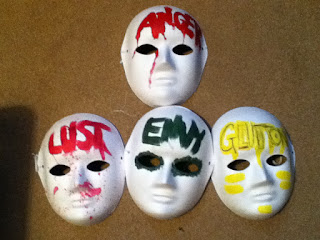
in which I have created the masks was through using acrylic paint, by allowing
the paint to run in areas that I wanted to create drip motions. The masks are
each unique to their own, showing the difference between each emotion. All of
the masks I created myself, but I found that the yellow didn't show up the way
that I wanted it to show, therefore I used a Biro to add an etching effect to
the text. Making it much more visible of what it says. The lust and Anger masks
represent the idea of bloodshed and the lust as if a gun has been shot, leaving
splatters of blood, increasing the level of danger and uncertainty for the
character. Overall, each mask is different to represent their own, individual
mark within the thriller opening.
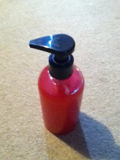
The red
bubble bath was used to bring colour into the scene in order to attract the audience’s
attention and keep their eyes on the significance of the colour. The red
symbolizes the idea of blood and danger, implying a sense of blood shed going
to happening, misleading the audience away from the direction we are taking
them in, tricking and deceiving them, giving them part here and there for them
to make their own prediction and conclusion about the scene, this way when the
truth is revealed they gain a scene of surprise. What will make a great
thriller is revealing elements where we want them and not giving everything
away all at the beginning in order to take them on a journey and reveal the
truth at the end, this way it creates drama, keeps the audience gripped to the
edge of their seat and makes them want more. The colour can suggest a number of
things including love or lust, death or blood and even anger. Showing a hint,
but not a full answer that determines the use of the red bubble bath. To
conclude, the bubble bath being red puts more of a sinister idea of the fact
that this is a thriller onto the audience, which builds tension and suspense.
Key characters- audience identity with
Theses
characters both represent the character in which we have exploring in our
thriller opening. They linking heavily to our character that is schizophrenic
like the characters both displayed at hand. From there expressions within the
pictures, it is clear to see they have taken the role to a new level,
portraying the condition an illness, there expressions represent the expression
of our character too, showing that the illness doesn’t just mental effects, but
can take a physical toil on your body also. However, their clothes that they
were wearing are very bland, with mainly
grey, using this as inspiration we dressed our character in black and greys to
replicate the idea and feeling of being empty and lacking happiness, related to
big and bright colours. Grey and blacks also create a sense of blending in,
trying to hide from the feelings and thoughts, rather than confronting them. Their
hair also falls naturally across their face, suggesting that they are using the
hair to also cover and disguise their face. The fact that her hair is naturally
also implies the lack of care to appearance, and just purely giving up as the
emotions are taking over and are being the main control. To conclude, the greys
clothing and both characters having dark hair shows the darkness taking control
over their body and trying to blend in to take away attention from them; as if
the emotions are draining the person of their personality and their whole
persona.
Emily Taylor
The Side Effect- (2013)
Tess
Doerner
The
4400
(US TV Series)


No comments:
Post a Comment